Purdue UX x Cisco U
Purdue UX Experience Studio Spring 2023
Project Overview
What is Cisco U?
Cisco U is a personalized online learning platform intended to prepare people to have the knowledge they need to acquire new certifications. Our focus on this project was to take the desktop learning platform and adapt it for a mobile platform while also adding new features that specifically cater to the mobile learning experience.
User Group
For this project, we focused on one of Cisco’s user personas: “The Rising Professional.” We chose this persona because it was most similar to our interviewees. We also found that the Rising Professional persona integrates well into the idea of Cisco U mobile. Since these people are employed and commuting to work, they have a bit of downtime during their commute that could easily be used for mobile learning.
Below is a visual describing Cisco’s Rising Professional persona. Rising Professionals are full-time employees looking to either develop new skills or brush up on pre-existing ones
Our Process
In order to best tackle our project’s problem space, we centered our work around three different pillars of Cisco U. For each of these pillars, our team utilized several research and design methods to eventually create our final designs.
Each pillar of our work and the methods that accompanied it are as follows:

Guidance | 
Depth | 
Community |
Goal: To develop a more personalized experience for users that is tailored to their needs as a learner.
Methods Used: Secondary Research, Interviews, Ideation, Wireframing, User Testing | Goal: To support users in enriching their learning through clearer access to supplemental materials.
Methods Used: Interviews, Ideation, Wireframing, User Testing | Goal: To provide opportunities for users to aid each other in their learning.
Methods Used: Competitive Analysis, Interviews, Ideation |
Guidance
How can users become familiarized with Cisco U and personalize their learning experience? How can we make the experience feel more independently tailored to them?
Research That Impacted Our Features:
- We conducted interviews so we can understand how people learn and prepare for certifications.
- Cisco’s Internal Research (such as competitor analysis and persona research) and our own secondary research showed us when users would use mobile in their day to day lives.
How does Cisco U Currently Guide Users?
Mapping out the current Cisco U Journey
Approach
To understand how Cisco U currently incorporates guidance into its design, we looked into the existing feature set and tried to map out a journey for any areas that could serve as a foundation for opportunities to enhance the journey in a mobile experience. Our main focus was looking at features that incorporated personalization and provided users with a clear blueprint for their learning.
Takeaways
- Cisco U recommends Learning Paths and certifications based on the user’s perceived learning level and professional experience and expanding on this featureset that we felt would be a good opportunity for us to explore
- There did not seem to be a huge emphasis on personalization in the user journey through logging in and starting a new learning path
- The user’s learning is tracked and kept as a record of how well they are doing in a learning path but does not give a clear idea of how much progress in terms of completion has been made and how users can better achieve their learning goals
- The mobile version does not make use of push notifications to keep users engaged with the Cisco U learning experience
Feature 1 - Goal Setting
Interviews
Takeaways
- One interviewee stated that they develop a game plan for learning once they get comfortable with online and physical learning tools
- Interviewees stated that they don’t like wasting time, especially when trying new things and prefer using tried and tested methods where possible
- Many interviewees employed motivation tactics, such as working with another person and setting goals for themselves to keep themselves engaged in their learning
- They held themselves accountable by future goals and the desire to learn, which is something we can use as an opportunity in our designs
“Thinking about my future goals and wanting to stay up-to-date with the rapidly changing tech industry helps me hold myself accountable.”
Wireframe based on the first round of research
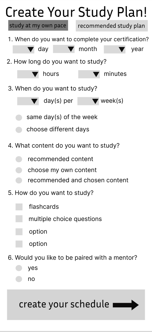
Based on the interviews, our main goal here was to create a study plan questionnaire to help users create a customized learning plan that fits within their schedule and helps them balance their time between working and studying.
|
Our original idea (as shown on the left) was that users would complete a questionnaire to make a custom study plan. The app would generate a plan based on their answers and the study plan would then be integrated with a calendar on the app.
This form also allowed users to indicate whether or not they wanted to be paired with a mentor since many interviewees indicated that they liked having a study buddy to hold them accountable.
|
Concept Testing
We conducted concept testing of our study plan wireframe with members of our user group, our professor, our TAs, and classmates to evaluate our ideas and get their feedback on what aspects they liked, what we should change, and what we should add. (see our protocol in Appendix C)
Takeaways
- Change “Study Plan” to “Goal Setting” to explain the use-case more clearly
- The phrasing of the questions is somewhat confusing in some parts
- The questions “What content do you want to study?” and “How do you want to study?” do not align with users’ expectations or needs for setting goals
- Remove “Would you like to be paired with a mentor?”, since it doesn’t fit with goal setting
- It would be more helpful to have the user create their own goals rather than goals being generated for them
- Users should be able to readjust/edit goals while taking a course
- Add push notification reminders
- Having the user fill out a study plan and then a calendar is overwhelming and redundant
Based on our feedback, we decided to just focus on three questions from the original study plan wireframe. We changed the phrasing of some questions to be more clear such as:
- When do you want to complete your certification?
- What days do you want to study? (Changed from: When do you want to study?)
- What time do you want to study? (Changed from: How long do you want to study?)
We chose these questions because they are the most important to consider when creating goals.
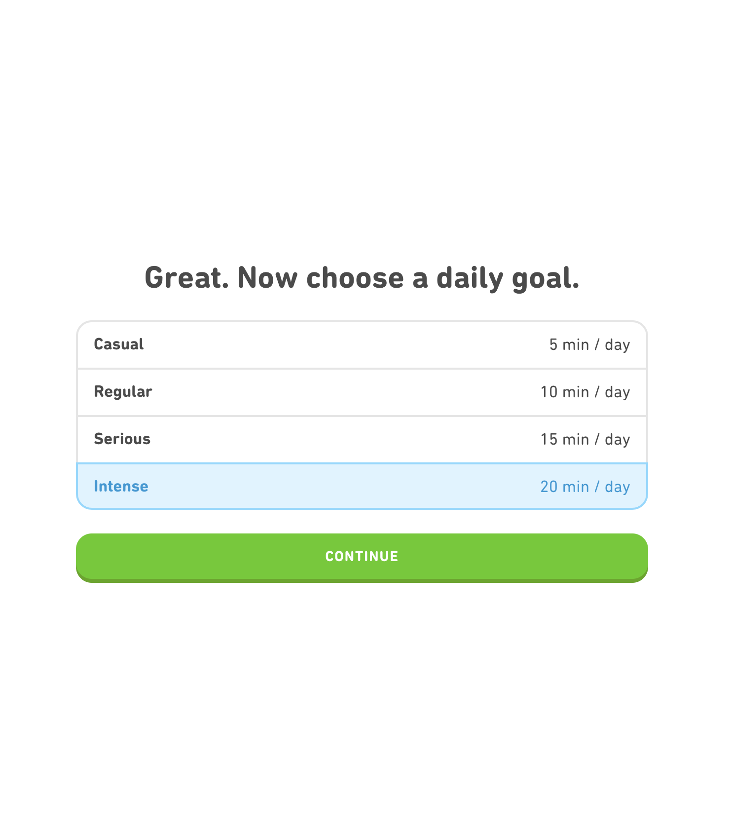
Instead of filling out a questionnaire, the user sets goals for themself. First, they select the day they would like to complete their course. Then, they select the days of the week they would like to study and the start and end times for their study sessions on those days. The user can modify their goals at any time.
Overall, our goal setting feature was well-liked and many people said they would find it useful.
Feature 2 - Calendars As an Extension of Users’ Learning Goals
Initial Prototype
|
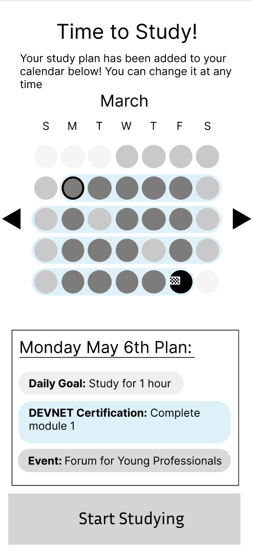
This wireframe was our initial design for how users could create their calendar.
Our initial idea was that users could view their calendars and goals. The darkened circles were dates with study activities, with the black circle being the planned completion date. |
Evaluation and Iteration
We concept-tested the above prototype with several users in our target user group..
Concept Evaluation Takeaways
- Integration of events like webinars and live streams to help with on-site learning that already exists within Cisco U. This will make these events more accessible to users.
- Calendars will be super helpful for accountability and keeping users on track with their goals
Additional Testing
We user-tested this calendar with people in our class, our professor, and TAs.
Takeaways
- The calendar UI is hard to follow; it may need a key
- Users thought that they had to fill in bubbles on the calendar screen when our team intended it all to be automatically populated.
- Users wanted the ability to add study time slots within the calendar
- Users should be able to edit their study goals from the calendar view
- The calendar in Cisco U should merge with personal calendars on their phones
Depth
Support the user to go deeper into their learning, allowing them to enrich their learning within the Cisco U platform through access to supplemental information
Research that impacted these features:
- We conducted interviews so we can understand what methods users employ to further their understanding of information for their certifications.
- We approached these interviews by asking our users what they do when confused on a topic and how they prefer to study concepts that they already learned.
- We wanted user’s to stay in-app for their study needs. This meant interviewing to see what aspects of studying most user’s were doing externally or outside of Cisco U and from there seeing what features we can make.
How does Cisco U Convey Depth of Learning?
Mapping out the Current Cisco U Journey
Approach
Since our definition of depth involves both information retention as well as allowing users to go into more detail within the subject matter that the users were already learning about using Cisco U, we wanted to explore the features that were already available to them and evaluate how effectively they were doing so. Our initial research also focused on understanding how the average Cisco U learner goes about learning and if the current Cisco U journey caters to those needs effectively. Any gaps identified in this stage could be key ideas we could take into our ideation sessions.
The main activities we performed to get a better understanding of depth in Cisco U were:
- Analysis of the existing user journey on Cisco U for features that focus on depth of learning
- User interviews to gauge their current learning habits and needs
- Analysis of competitor apps and feature sets that learners incorporated as part of their learning routines outside of Cisco U
Takeaways
- Cisco U already has multiple features such as podcasts, webinars and articles that go into more depth of the content covered in a learning path, however the additional content is harder to locate on the current interface, making it difficult for users to access it
- As verified by the interviews, users were not aware of the additional content that Cisco U provides and they often went out of their way to search for supplementary material on competitor learning and podcast sites such as Spotify and Udemy
- Listening to audio content was a common practice for learners during their commute or at night while revising studied content
- Learners often made use of other apps to take notes and revise the content they had studied such as Notion, Jupyter notebook, Obsidian, and Markdown
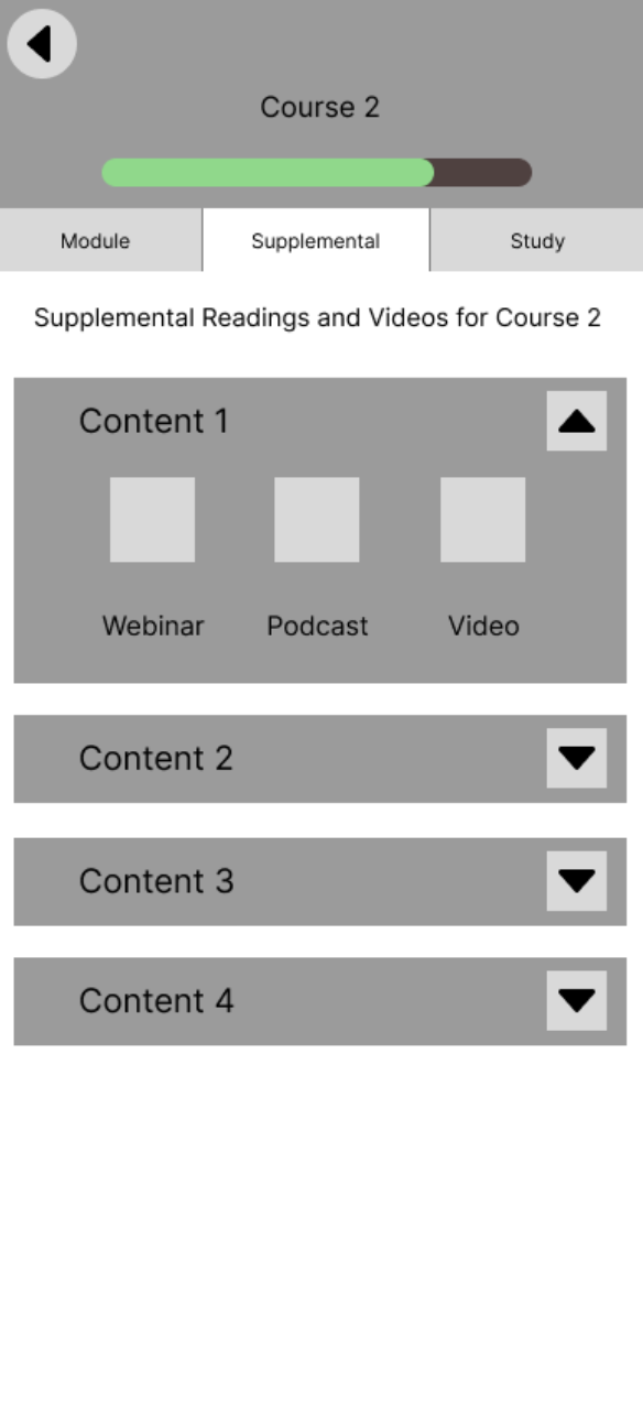
Feature 1 - Supplemental Content
The Supplemental Content section provides users with all the additional materials necessary to broaden their comprehension of a given topic. This includes a variety of resources such as podcasts, webinars, and videos, which can all be accessed from this page.
Interviews
Approach
We interviewed several rising professionals, and they discussed supplemental learning. We kept the questions open-ended to get genuine and honest answers from the interviewees. These interviews were provided by UserTesting.com and scheduled by Aiza.
Takeaways
- Found it difficult to find supplemental content
- Users often sought other sources for more learning material than just Cisco U
- Cisco U learners like having a plethora of resources and are very passionate about learning
Wireframe
Prototypes
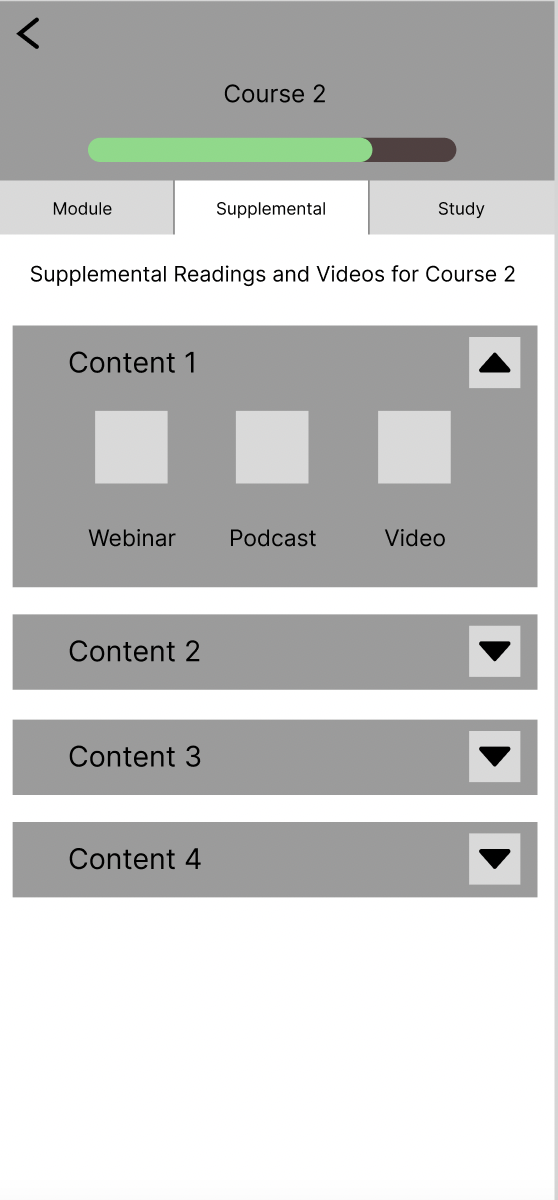
|
This is the prototype of the supplemental content. We have it organized by content. It will be found under the course. We brainstormed on where to put it, and we want the user to see what content they have based on the module they are in. If they are struggling, of course then they can see all the supplemental content they can watch. |
Testing
Approach
We conducted user testing on our teaching assistants (TAs), where we demonstrated the features we developed and solicited feedback on our designs. Our objective was to gauge the confusion levels and areas requiring assistance for someone who is new to the features.
Takeaways
- Both TA’s liked how supplemental content was under the course
- One said it was easier to see what’s available for them regarding each learning path
- Another said, “People can be more aware” of the content when it is under the course, meaning the visual hierarchy of the page made sense to them
Big Takeaways and Next-Steps
Users want supplemental content and to learn more, so by having it all on Cisco U the user does not need to find their content. Our goal with Cisco U is to have all the resources a user would need to study on one application, and supplemental content is all the extra content in one place.
Some next steps are to collect supplemental content and make it organized in an easy way (general content or based on the certificate the user is taking to have a filter on the content). We brainstormed on where this will be found, right now, we have it under the course but we also thought about having supplemental content as its own page.
Feature 2 - In-App Flashcards
Our flashcards section was designed to provide users with a tool to study and review content. Flashcards will be populated with the end of module questions, and users can also make their flashcards based on the content they want to review.
Interviews
We interviewed several professionals who have worked through a certificate and discussed their study habits. Protocols for these interviews can be found in Appendix A.
Takeaways
- Interviewees liked personalized learning
- Users went to outside study programs: external studying
- User’s watched a lot of youtube videos
- Read a lot of materials online
Wireframe
 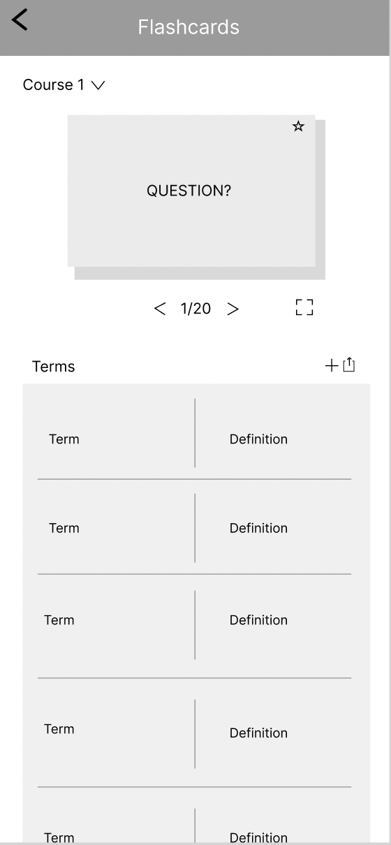
|
Prototype + Inspiration
This is the flashcard page. A feature to start the card allows users to select cards they struggle with. Also, users can see the cards in an expanded form by scrolling down on the page. |
User Testing
A round of user testing on the flashcards was performed on our TA’s to gain feedback. Protocols can be found in Appendix D.
Takeaways From Testing
- Adding pre-populated content based on the lesson
- Users want a way to add flashcards from highlighted content
- Our team needs to make it clear how to make a flashcard by highlighting text in the module.
- Reorganize where the user can access their flashcards
- Currently, it’s too deep within course content
Feature 3 - Exploring In-app Note-taking
Our notes function was designed to be a storage space for all of the saved information throughout a course.
Interviews
We interviewed several rising professionals, and they discussed how they like to maintain depth within their learning. The protocol can be found in Appendix B.
Takeaways
- Several users already use note-taking functions
- Obsidian
- Jupyter Notebooks
- These note-taking functions can go into Cisco U to help learning
- Further the “one-stop shop” nature of the platform
Research-based Wireframes
We decided to model our notes function based on the notes app and wanted to sort sections by lesson, course, and module.
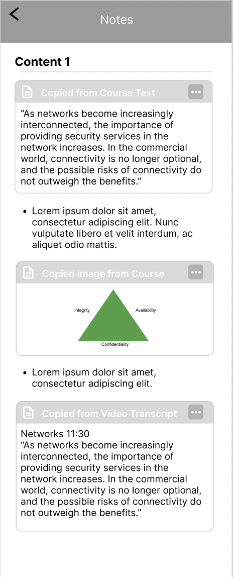 
|
Notes will be organized by content. WIthin the notes per content user’s can copy over sections and texts from the module and add their own annotations and notes.
|
User Testing
A round of user testing on the flashcards was performed on our TA’s to gain feedback on our features. The protocol for this test is in Appendix D.
Takeaways
- Users liked how easy it was to add notes and copy text from module over to the notes.
- Notes are not yet easily accessible and viewable. They’re deeply nested within course content
Community
How people interact with each other to build an accountable and supportive environment centered around learning.
Research that Impacted these Features:
- We conducted a competitive analysis on how other learning platforms provided opportunities for community to understand how they can provide resources for help and connection
- We conducted four interviews to learn more about what value a community could bring to users of Cisco U within a mobile experience
How does Cisco U currently implement a community for learners?
Analyzing the current journey learners take to access a community on Cisco U
Approach
To understand how Cisco U currently approaches community, we analyzed the platform and held some interviews with members of our user group. Additionally, we want to understand how we could create new opportunities for a community on Cisco U to enhance users' learning and networking experience. Our main focus of this part of our project was to understand how we could integrate elements of community into the existing framework of Cisco U. We wanted to avoid adding entirely new and separate features that are withdrawn from the current user flows and processes we identified earlier on in our work.
Takeaways
- Cisco U’s community is mostly outsourced into the Cisco Learning Network (CLN)
- In the CLN, users can ask questions on topics, lessons, and other industry-related content
- Cisco U offers live in-person and online events to connect people and speakers through the Cisco Live service
- Many of these events are hidden away and only accessible through a specific link located in the footer of the Cisco U home page
- There is an overall lack of emphasis on community on Cisco U, it is difficult to reach out to others within the platform itself
- There is no way to reach out to others while within a learning module without opening up multiple tabs in your browser
Opportunities for Community in mobile learning
Looking at competitors in mobile learning
Approach
We looked into 5 different learning tools containing varying kinds of community centered features. These included: LinkedIn Learning, Coursera, Duolingo, Rosetta Stone, and the Discord for Google Certificates (a recommendation to look into from the Desk Critique). For each we asked questions such as, “What community features do we want to take inspiration from?” “Existing resources for help? How can someone answer their questions?” and “How do they connect people?” and we also categorized strengths, weaknesses, and opportunities for each.
Takeaways
- 3/5 can connect users to mentors or accountability partners
- Discord for Google Certificates provides a channel called “study buddy” providing accountability
- Coursera’s forums can connect users to mentors, but they may not always be active
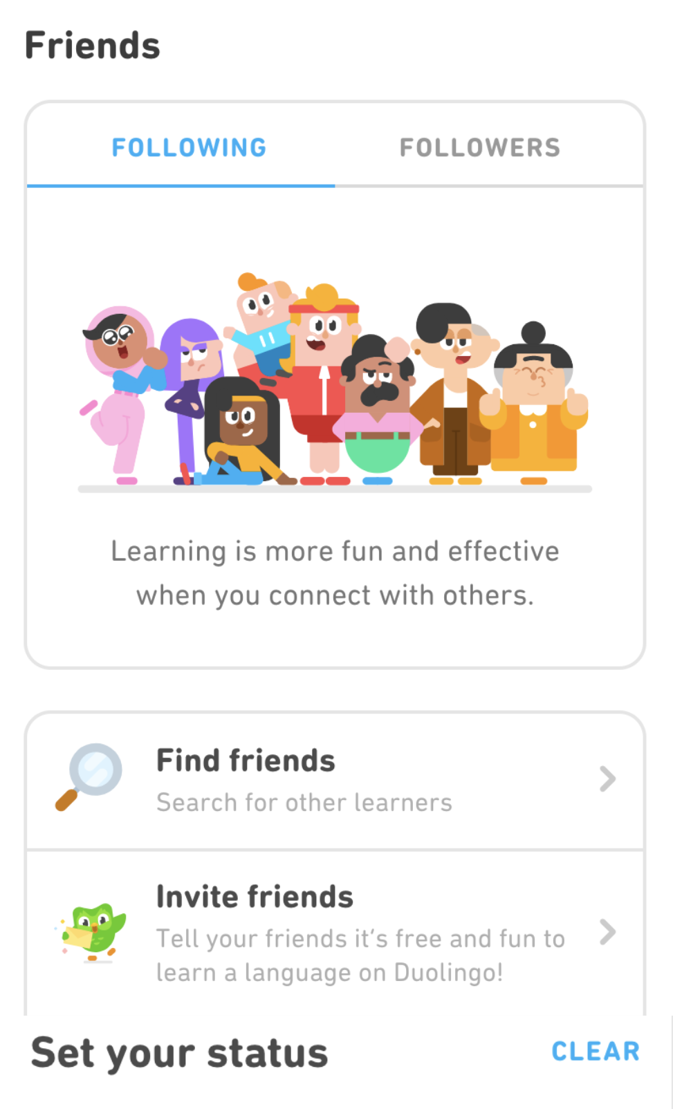
- Duolingo has a friends system in place, where users can be rewarded for completing a shared goal with a friend
- 4/5 user forums to support “Peer to Peer feedback” and in some cases (3/5) “Professional to Peer feedback”
- Rosetta stone offers instructor’s contact information
- “Professional to Peer” feedback can be seen in LinkedIn Learning as the “Instructor” of the course can answer questions. View the image below to see an instructor’s response to a post in the Q/A of a video:

- LinkedIn Learning uses a Q/A styled forum within each video of a course. When posting a question, the time stamp from the transcript is also included in the question
How do our Users Interact with Community?
Interview Takeaways
Based on four 45 minute interviews with industry professionals who have experience using Cisco Learning Network, we found insights relating to how they might engage with their community through their learning process.
Relevant Feedback from Others
- Someone shared they value information from industry professionals
- It can be hard to filter through online social media and forums to find professional resources because there can be too much unhelpful or false info
- “Cisco Learning Network can provide more meaningful pieces of information over the cisco courses themselves that are up to date”
- Referring to the fact that some of the forum posts are not up to date
Community Forums
- "I don't usually post questions, but I find the answer I'm looking for through browsing what others have posted on forums"
- Mentioned they might search for an answer online rather than asking friend first
- Someone mentioned they like forums because they can learn from someone else and know they aren’t alone
- “Community would be better if separated by certification, rather than all being together”
Benefits of Community
- “The human connection would be a motivation boost”
Moving forward with these Insights
- A Q/A could serve as an opportunity for industry professionals to provide feedback to user’s misunderstandings
- Browsing other people’s questions and answers would be helpful for those who would prefer not posting themselves
- Providing opportunities for community within each course might be a helpful addition to each learning path
Feature- Question and Answer Forums
Ideation
Approach
We completed some open-ended sketching activities to ideate how the concept of community might look within Cisco U.
Sketches
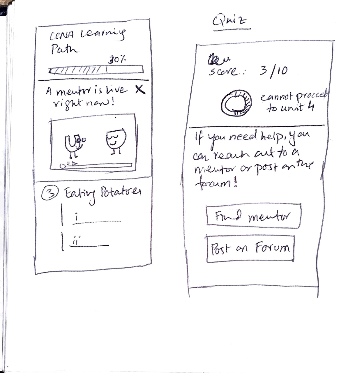
After scoring low on review questions, users could “Post on a Forum” to receive help from the community | 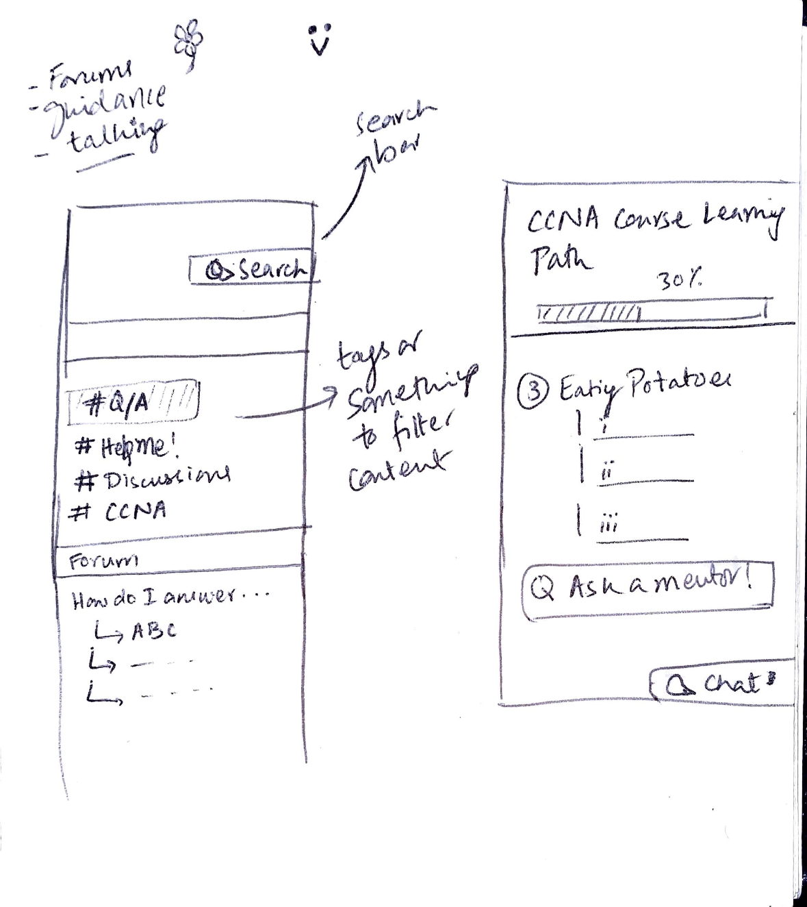
Users can access a Q/A tab within a learning path |
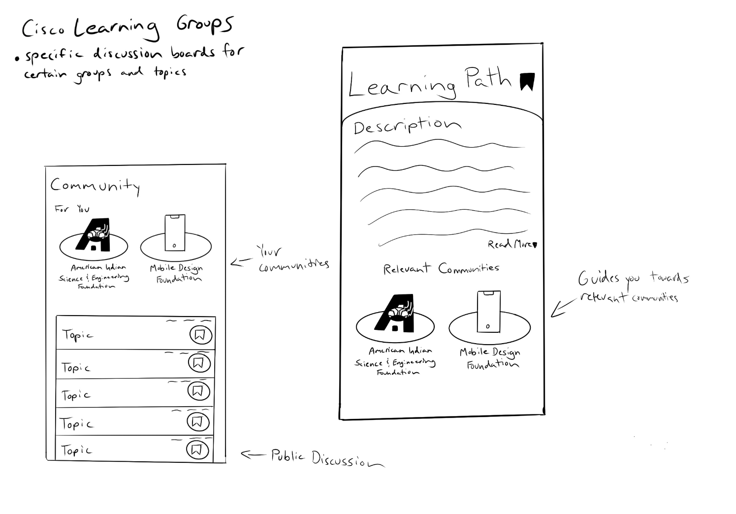
Provide users the opportunity to join relevant communities based on the learning path they are studying | 
Use tabs to organize users’ relevant information, including a tab for “Groups” |
Takeaways
We felt that the most realistic and helpful way, based on our research, to involve the community into Cisco U would be to nest a forum styled Q/A within each course.
Rationale for this includes:
- Fits into the flow of our users’ study habits
- Convenient if users have questions while working through course content
- Provides an opportunity for peers or professionals to answer questions and provide feedback
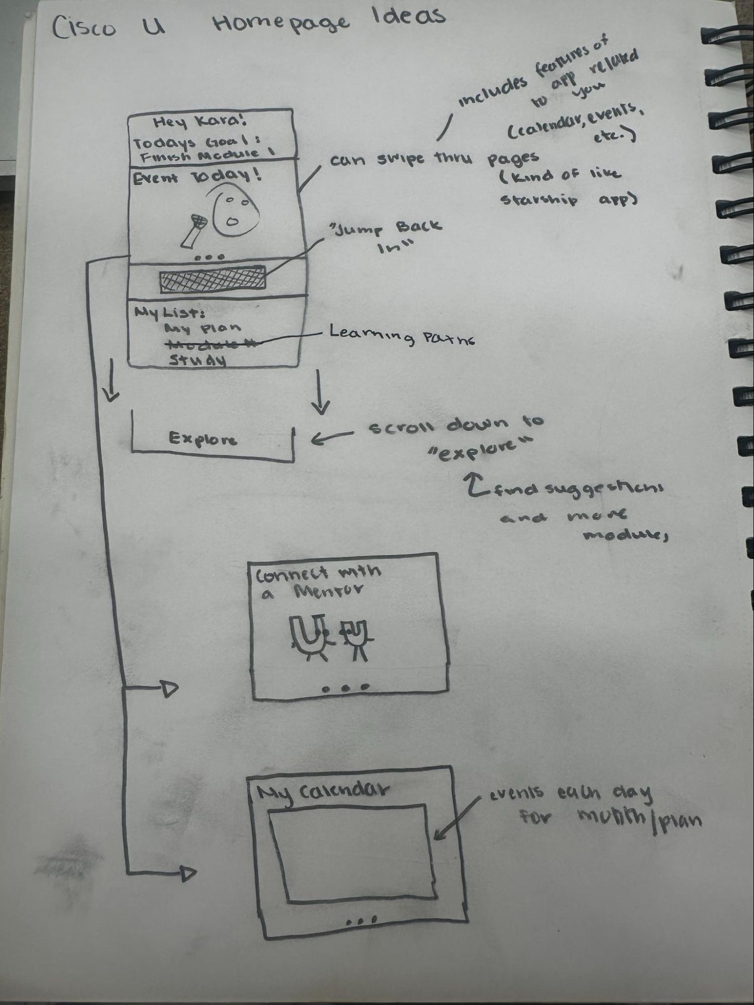
Home Page
The following pages cover the research and ideation behind the main landing page on the Cisco U mobile app and the home page design for Learning Paths
Home Page
Competitive Analysis
|
In our competitive analysis, we found Rosetta Stone’s home page was very clean and efficient and detailed everything very clearly. We took some page layout inspiration from here as well as from the progress bars shown on top of the homepage. |
Ideation
EX: “Starship” app banner | Goal: Connect all features to make them easily accessible for users.
Our Ideas: - Personalized with name and current courses
- Inspired by “Rosetta Stone” App
- Inspired by “Duolingo” App
- Has personalized announcements
- Upcoming Events
- Various “deals”
- Important reminders
- Inspired by “Starship” App
- Shows progress in learning paths under “My List”
- Inspired by “Rosetta Stone” App
- Takes users back to where they left off on desktop
Rationale: - Interviewees found this would be motivating.
- Many interviewees were unaware of many features Cisco U has. This gives them the opportunity to see them.
- Interviewees found that having a
- Makes it easier for users to jump back and forth between mobile and desktop.
- Interviewees liked this in concept testing
|
Iterations
|
In these iterations, we combined ideas from our initial ideation stage and created a variety of slightly higher fidelity wireframes based on our different concepts. These designs kept the carousel, the sync function, the layout, in addition to adding progress bars and goals. |
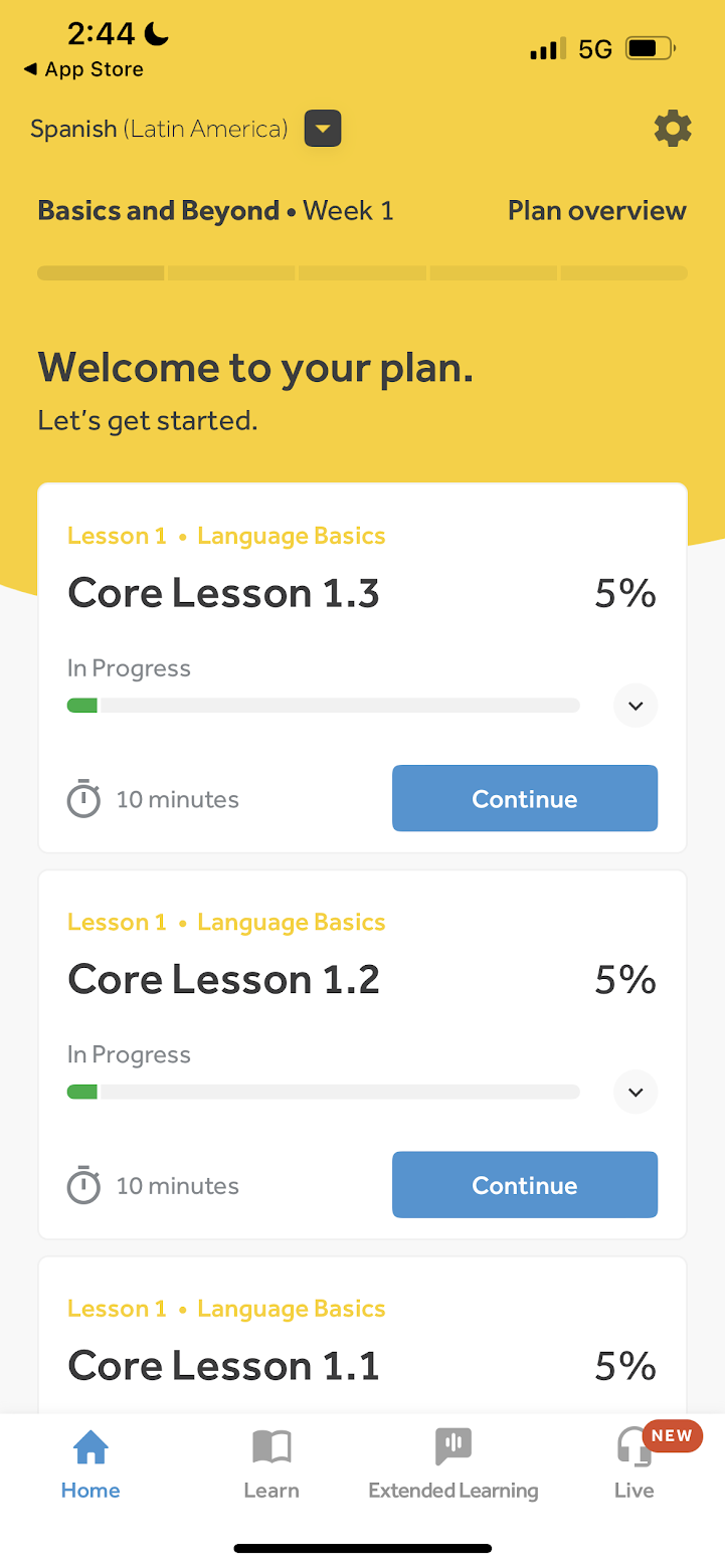
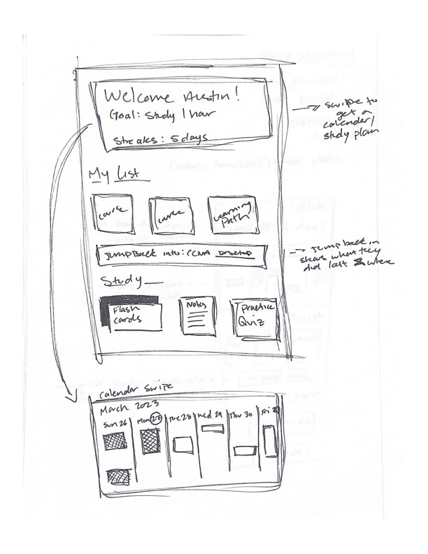
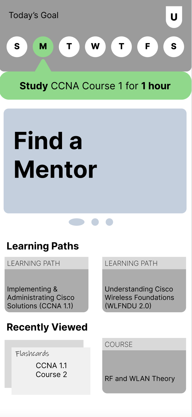
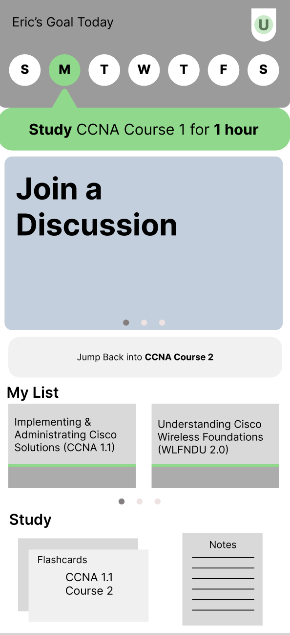
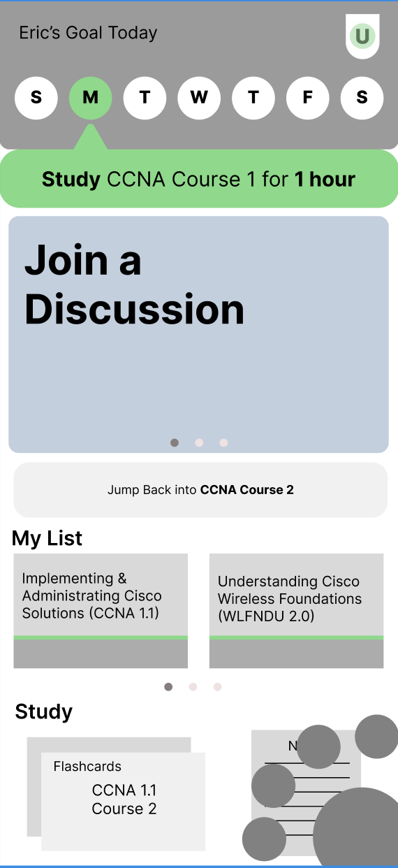
Final Design
|
In our final wireframe, we combined features from our two iterations. As shown in the example screen to the left, the top of the screen will list the user’s name and goal for the selected day.
As the user selects each day it shows their goals for the week. The carousel will show current features of Cisco U, promotions, or anything else that could be important for the user to see. The “Jump Back In” button will be used so users can sync with where they left off on desktop on mobile.
Going down to “My List”, all of the learning paths the user is currently taking along with their progress will be shown. The “Study” page will also have the user’s flashcards and notes. |
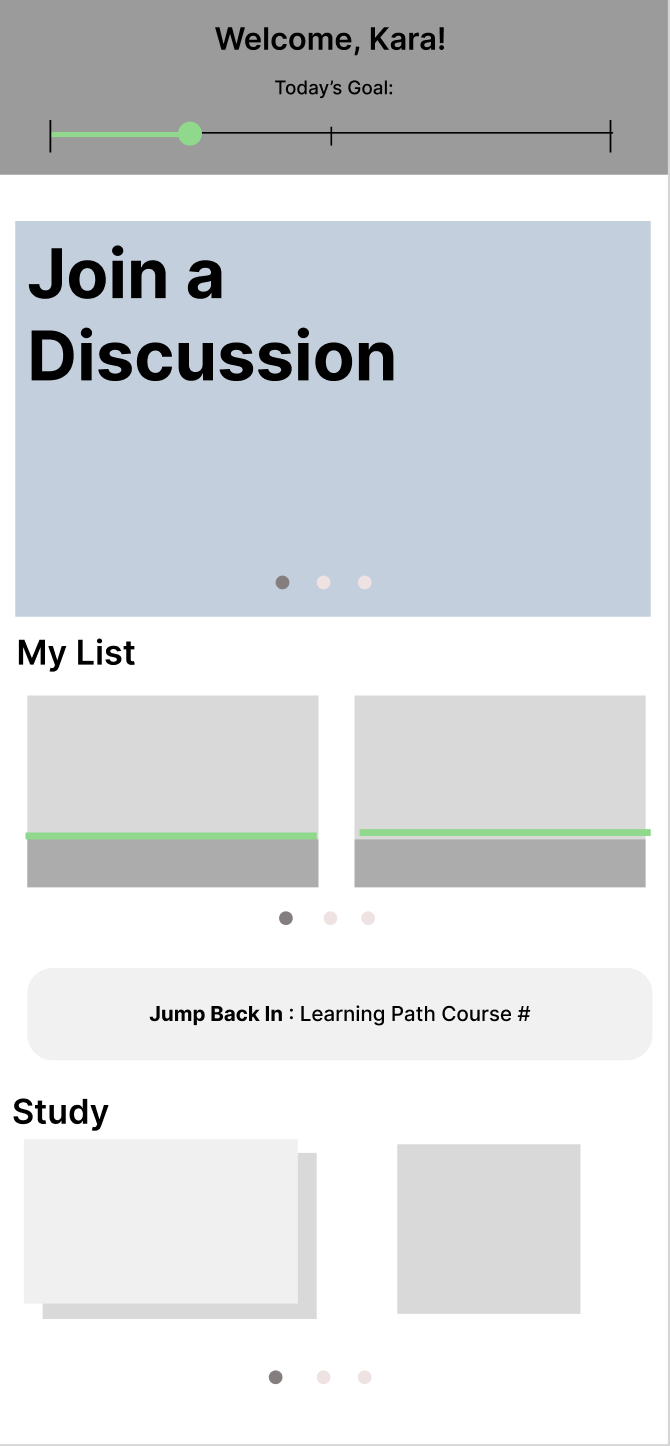
Additional Ideations
|
Towards the end of our project, our group began to develop a set of slightly higher fidelity wireframes for our home page with some refined features or new concepts. Most of our work here involved concepts for a navigation bar that included features such as a goals/calendar view, a q/a page, and notes.
Although we were unable to thouroughly test these designs with members of our user group, we did perform some rapid fire-styled user testing with our UX peers and TAs. Through this feedback, we found that having a traditional-styled navigation bar would be more easy to use on the go and that the “Jump Back In” button should get pushed below the My List. |
Learning Path Home Page
When opening a learning path, this is the screen a user would see.
Research
| In our competitive analysis, we again took inspiration from Rosetta Stone’s progress bars. We also took inspiration from Duolingo’s goal setting.
Through our interviews with users of Cisco U, we were able to find that many of them believed they would benefit from a linear progress bar styled graphic, similar to the one seen with Rosetta Stone.
Our interviewees also stated that they believed a set of daily goals would be beneficial in helping them stay on track with their learning. |
Ideation
|
Goal: Create a learning path homepage that aligns with our home page layout.
Our Ideas: - Organize course content (supplemental information like notes, flashcards, podcasts)
- Received feedback in testing that these tabs were confusing, opted to change this in the next round.
- Show how much is done within courses and modules in learning path
Rationale: - Ideally organize content in a way that is easier for users to understand
- Interview insights say this helps with motivation and maintaining goals
|
Final Design
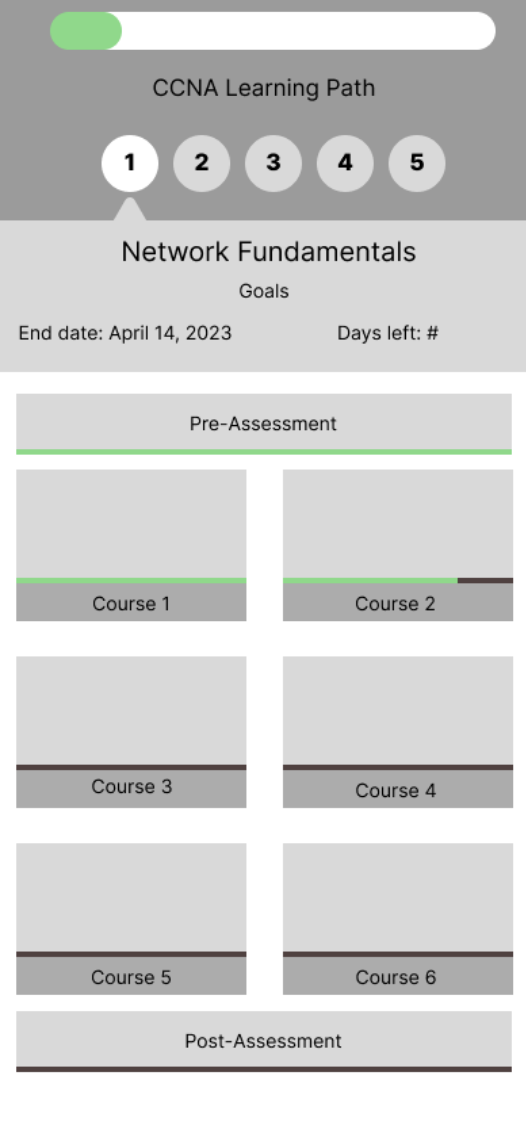
| After receiving feedback that our material for each module should not be separated from the supplemental and study material, we developed the final version of our learning path home screen.
The top of the screen now shows how much of the learning path is completed, followed by numbered modules and the goal date to complete each module. There are also progress bars for each course as well as the pre and post assessments. |
Conclusion
To conclude this project, we evaluated the final design concepts one more time. We also summarize some additional ideas for future work.
Final Usability Test
Goals
- Understand users’ expectations of how features would be displayed or nested within the mobile app
- Evaluate which features they would likely use and find helpful when learning
Approach
We wanted to test with Cisco U users interested in a mobile app. However, due to time constraints, we could not test with people from our user group; instead, we tested and evaluated with our TAs in class.
Takeaways
Homepage
Users would like to see more relevant information in the homepage carousel, such as:
- “Supplemental materials” to their learning
- Recommended learning paths to take
- Joining discussions for the module or learning path users are on
Testers were confused about what “jump back in” meant. Changing the wording so it is clearer to users that this button is for returning to the content users were on their desktop would be better. |

|
Goal Setting
We learned that users would like to know if they are falling behind on deadlines or goals that they set for themselves. They would also like to have a pop-up asking if they would like to change their goals.
Q & A
Some of the interactions in the Q & A section were unclear
- Users would like for us to make it clearer that when they ask a question in the Q/A feature, it is tied directly to the part they highlighted in the video transcript, rather then being posted to a discussion forum.
Notes
A tester said that they would use the notes section on the phone as a reminder of content to review rather than a way to annotate content.
Flashcards
Users want both auto-generated content and a way to add their flashcards of the material.
Menu Navigation
Users expect a menu item with a home, their profile, and your courses.
Additional Ideas
During the exploration of multiple features throughout this project, we explored a few concepts that were more exploratory on our end and could be expanded on in the future. For the sake of this project’s scope, however, these ideas were excluded from the final designs we created but have been documented here for the sake of completion.
Mentor/Mentee
Interview Takeaways
Based on four 45 minute interviews we conducted with people who have experience using Cisco Learning Network, (see Appendix B) we found insights relating to how our users engage with mentorship.
Mentoring
- An interviewee stated they think collaborating with people is key to learning, especially when confused
- One interviewee was interested in being a mentor because they like helping people with tech and complex problems
- There was a general concern about having to pay for a mentor
- “My friend’s drive to learn and improve inspires me to learn more”
- 2/4 interviewees mentioned their friends and colleagues inspire them
- Someone mentioned they have several mentors, some professional and some not
- “One mentor may be better in one part of course and another is better in a different part. So different mentors throughout the course?”
- This is a useful insight as it could be valuable to have multiple mentors for each learner
Ideation
Sketches
|
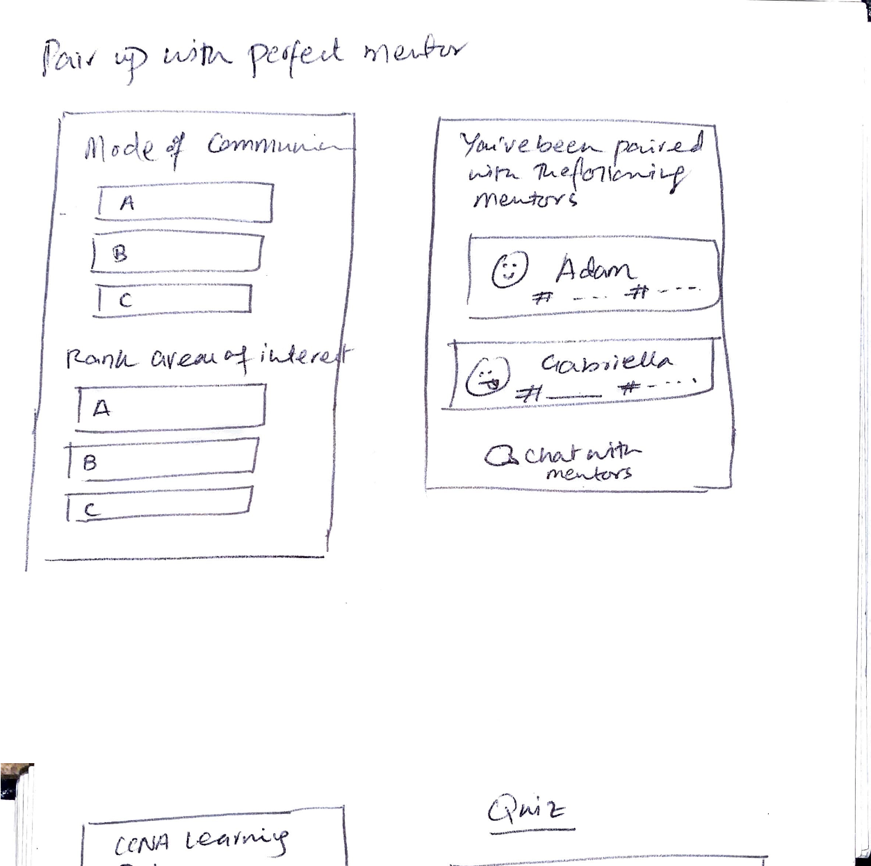
The initial sketches of this concept explored the option of allowing users to contact and be matched up with a mentor who best suits their learning needs
The option to contact a mentor could be accessible from the learning path itself. The pairing process would be based on the learner’s preferred mode of communication and areas of interest. Paired mentors can also be highlighted on the learning path so that users can contact them when needed. |
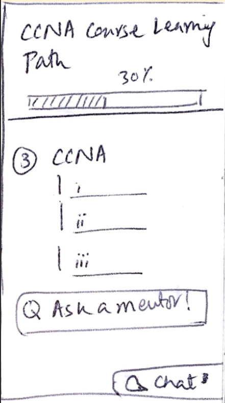
Wireframes
|
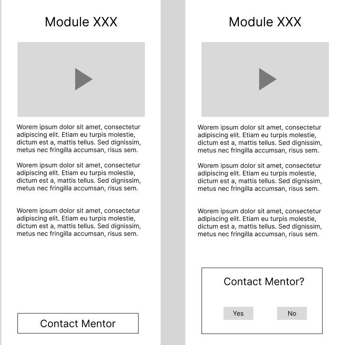
These wireframes were designed for concept testing to evaluate if users would like having the option to contact mentors. Users can contact a mentor if they are confused by a certain course section through a button at the end of the lesson. |
Navigation Bar
Initial Wireframe
|
This is a conceptual design of how the navigation bar would look within Cisco U Mobile. We used our final user test to determine what would be most helpful to have on a navigation bar, and we found the best features were the home page, a user profile, and the last opened course. |
Limitations
Our design is for mobile software, so we had to design around mobile constraints, creating additional limitations.
Mobile-Specific Design Constraints
- Learners find it difficult to attempt labs on mobile phones and prefer using their laptop/desktops
- Labs are not well suited for mobile use. Labs must be done on desktop because they require coding and specialized software that doesn’t exist on mobile. We found that there was no way to easily integrate them to mobile for handoff.
- Most interviewees said they did not want to use their mobile phones to attempt labs regardless
- Mobile screen size tend to be small, so care needs to be taken that text and font sizes need to be readable
- Downloading data + Storage space
- Mobile phones don’t have a lot of storage space compared to desktop devices, so we need to make sure that relevant content is downloadable.
Other Limitations
- Our team did not have time to focus on high-fidelity because we spent most of the semester exploring opportunities to expand guidance, community, and depth in mobile use-cases.
- We designed Cisco U Mobile to supplement learning that is already taking place using the desktop version of Cisco U.
- Cisco U Mobile can’t stand alone and needs to be used with the desktop version in order to be usable.
- We don’t have high-fidelity wireframes, and these concepts are not as refined as they could be. They definitely need some fine-tuning down the road.
Next Steps
For this project, our team was more focused on exploring new ideas and experiences for mobile instead of refined high-fidelity wireframes. Our focus was on how features would be integrated into supplemental learning rather than focusing on the visual design. Instead of design, we focused more on user interaction with specific learning features, and how those features would transfer to a mobile experience.
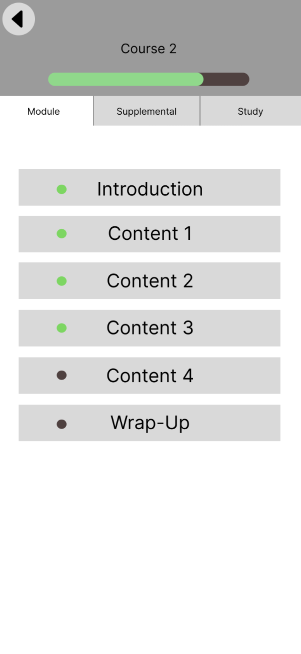
Something we found in our own testing of Cisco U mobile was that a lot of our depth-based content (flashcards, notes, and supplemental material) was nested too deeply within a given learning path. In our designs, it currently resides at the course level. However, for future iterations, our team felt that it would be smart to have this content at either the module level or learning path level. This would help with accessibility and allow for this content to be more actively used within Cisco U Mobile.
Our team also developed a few designs for a navigation bar in order to allow users to quickly switch between features such as notes, courses, and a user profile. Our team felt this would help users navigate the app easier and allow them to access more content in an easier manner.
Since all of the screens in this project are low to mid-fidelity, our team ideally wants to push these screens into a high fidelity if we have a chance to further the design process.
Final Remarks
Our team was able to work collaboratively and effectively over the course of this semester during the process of this project. As a result of this, our team has been able to trust each other really well and operate smoothly. A huge thing our team struggled with was getting the scope of the design down quickly. There were a lot of times early in development where our team would struggle with Cisco U itself and how vast the scope is meant to be for this project.
Ideally, our team could have done more testing to narrow the scope of our design early on. Our team also was unable to schedule sessions to help understand Cisco U as a platform and work with Cisco to build a design strategy. This was always an option, but our team failed to reach out due to anxieties about communication with our sponsors. As a whole, our team communicated well internally, but had a bit more of a struggle externally.
Working on this project has been a pleasure for everyone on the team. We really hope you find use out of our work. It’s been a pleasure to work with Cisco this semester.